Social media platforms are constantly upgrading by changing the algorithms for better personalization of what the users see in the feeds. As a business, the chances of the target audience seeing our organic content on social media platforms is extremely lower than it was ever before. The situation seems like a pay-to-play. Facebook Ads are the best way for increasing sales, but only the best outcome comes when the game is being played with perfect strategies. And among all other strategies, stunning creatives with customized ad copies hold the highest position on the throne.
Guidelines for Creatives
Using stunning images will be helpful to grab the attention of the user. We have to make sure that we are always using high-quality images in our ads. We should choose those images that always follow these guidelines:
- The image should be bright, full of colors, and extremely eye-catching.
- We have to avoid images that are the same colors as Facebook (a combination of blue and white) because they can easily blend in, and our audience won’t notice them properly.
- Generally, the presence of women in the image performs better than images of men.
- We have to make sure we choose an image that is in the proper size for the ad type we have selected.
- Shadows and reflections work better than regular images.
- Review-based image content performs better than usual.
- Contents with a better saturation can grab better attention than usual.
Let’s see some real images of ads for better differences.


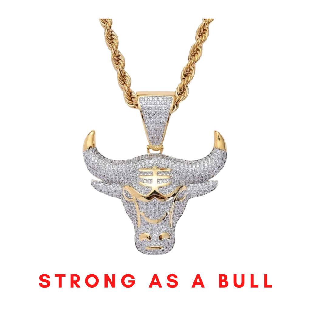
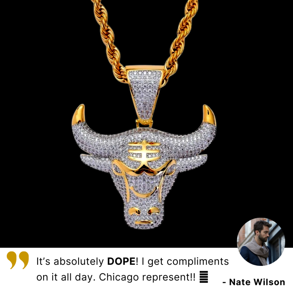
Here, the left one with a white background performs less than the right one. Why is that? Because the product can’t create a better contrast ratio. But the right one with the black background has managed that with a better contrast ratio. The white necklace with a golden finishing helps the product highlight the black background. The ROAS for the left product was 1.09, whereas the right one has a ROAS of 1.77.


Here we can see the same image with two different color tones. The left one is the original photo whereas the right one is a saturated one. We can easily differentiate which seems a better and eye-catchy one. Of course the right one.


There are two different images out here. The left one has more blank space but is extremely clean. About the right one, it is a bit overloaded with information but more relative. And the right one is a better performer. The ROAS for the left product was 2.27, whereas the right one has a ROAS of 3.73.
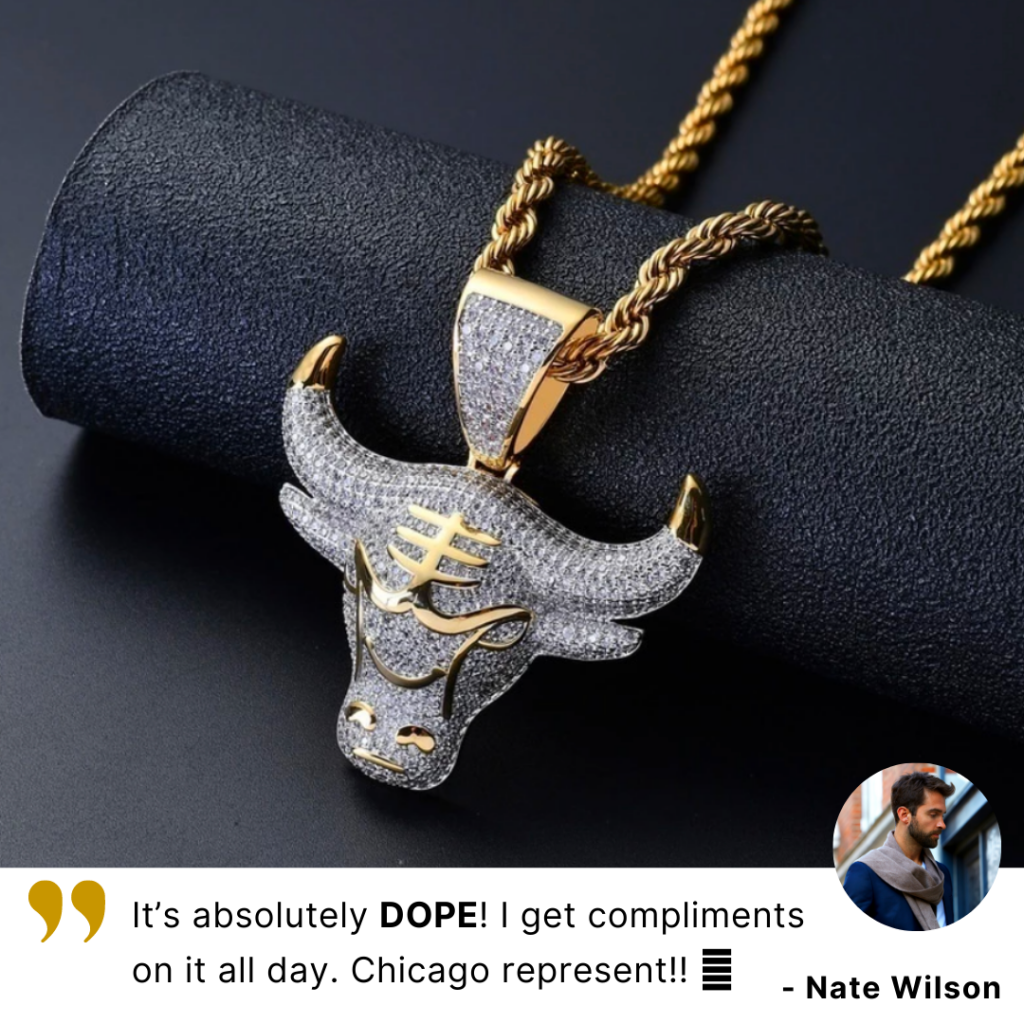
But for the first phase, this image performed well. Three reasons behind that – background contrasting with the product, review with the image, and a catchy image site. It has a ROAS of 3.01.
So far, the winner among all the creatives is the one that focuses on the following things:
- A very clear and stunning view of the actual product.
- The product is very saturated, especially the golden part which makes the image extremely eye-catchy
- The shadow effect helps a lot to create a layer by distinguishing the product from the background.
- The review part helps to connect the emotion with the product and thoughts.
- Side icons fill the gap in the image and highlight the facts about the product.
The game isn’t over yet. Ad copies play an important role while running any ads. It’s very essential to create amazing ad copies and it has to be connected with different terms – relevant to the creative and highlight the product details. After passing two different phases, one creative has done the best performance with the best ad copies on it.
Read more about another case study USD 3,000 to 300,000 Sales in Two Weeks – A Case Study on Linens N’ Things (LNT)
Ad copy 1:
Always remember that you have it within you to fight any battle. You are born a winner.
`This Raging Bull necklace is the perfect accessory to make you feel unstoppable any day of the week!
Until midnight, we’re offering 50% OFF + FREE Shipping. Offer valid while supplies last.
Ad copy 2:
A Chicagoan is never afraid of showing affection to the origin. You are born a winner and never bow down to anything till defeat.
This Raging Bull necklace is the perfect accessory to show your love for Chicago. And it’s absolutely DOPE!!! See how the Chicagoan feels it.
Until midnight, we’re offering 50% OFF + FREE Shipping. Offer valid while supplies last.
So how does the ROAS jumps from 3.73 to 5.7? Well, a few things worked behind that:
- Bull is the icon of Chicago people, since the product is mostly targeted at the Chicago people, it hits the first case when the creative refers to the “CHICAGOANS” and the caption does the same. But in the first case, only the creative does the job but the caption isn’t.
- The second caption represents the nature of the Chicago people in a strong tone whereas the first represents a very soft tone. People in Chicago are more strong and aggressive in nature, so they can easily connect with the tone.
- The winner or achiever tone fits more with the product.
A product’s success doesn’t depend only on the creative, but also the tone of the ad copy and the message the creative can represent. Most importantly, both factors need to be relevant and inter-connected. Only then we can expect a boost on product ROAS.


1 Comment